Case Study
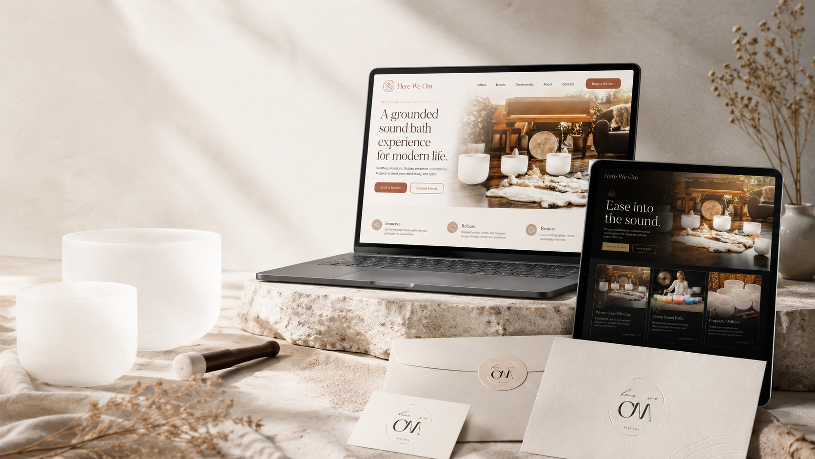
Here We Om
Wellness brand and site concept with calm UX, service clarity, events, and conversion-focused CTAs.
Project Snapshot
Overview
What the project needed to make clear.
Here We Om needed a website direction that felt calm, refined, and personal without looking like a generic wellness template. The goal was to create a more polished digital presence that could support the brand’s healing, movement, meditation, and wellness work while making the site easier for visitors to understand and use.
This project focused on bringing more structure, warmth, and visual clarity to the brand so the website could feel peaceful, professional, and trustworthy from the first visit.
Challenge
The existing Here We Om website had meaningful energy behind it, but the presentation needed to feel more elevated and easier to navigate.
The brand needed a website that could do more than simply display information. It had to explain the work clearly, guide visitors through the services, and create a feeling of calm confidence. For a wellness brand, the website cannot feel cluttered, confusing, or overly commercial. It has to give people space to breathe while still helping them take the next step.
The challenge was to create a design direction that felt peaceful and high-end without losing the human warmth of the brand.
Strategy
The strategy was to build the site around clarity, atmosphere, and trust.
Instead of forcing the brand into a standard template, the direction focused on creating a cleaner visual system with softer pacing, stronger page organization, and a more intentional flow from introduction to services to contact.
The design direction used calming imagery, warm natural tones, refined typography, and simple navigation to help visitors understand what Here We Om offers without feeling overwhelmed. The content was shaped to sound approachable, not corporate, while still giving the site enough structure for search engines and future growth.
The site needed to feel like a quiet invitation, not a sales pitch.
Result
The new Here We Om direction gives the brand a clearer and more polished online presence.
The site concept feels calmer, more professional, and easier to understand. Visitors can quickly get a sense of the brand, explore the services, and move toward booking or making contact without feeling lost.
The updated structure also gives the business a stronger foundation for future SEO, content expansion, service updates, and brand storytelling.
The biggest improvement is that the website now feels more aligned with the work itself: grounded, thoughtful, peaceful, and personal.
Work Completed
What FultonStudio changed.
FultonStudio created a more refined website direction for Here We Om, including homepage layout, service structure, visual styling, and content organization.
The homepage was planned to introduce the brand clearly, explain the feeling behind the work, and guide visitors toward the most important areas of the site. Service content was organized so visitors could quickly understand what is offered and whether it fits what they are looking for.
The visual direction was cleaned up to feel more premium, calm, and intentional. The design avoided clutter, loud graphics, and generic wellness styling. Instead, the focus was on atmosphere, simplicity, and trust.
The project also included SEO-ready copy structure, improved page hierarchy, stronger calls to action, and a backend concept that would allow the client to update imagery, text, service sections, and homepage content more easily.
Project Images
Before, after, and supporting visuals.
A tighter image grid keeps the page clean. Captions open inside the lightbox instead of crowding the thumbnail layout.
More Case Studies
Keep looking through the work.
Return to the full case study archive or move through another project example.
View All Case Studies